AltoCode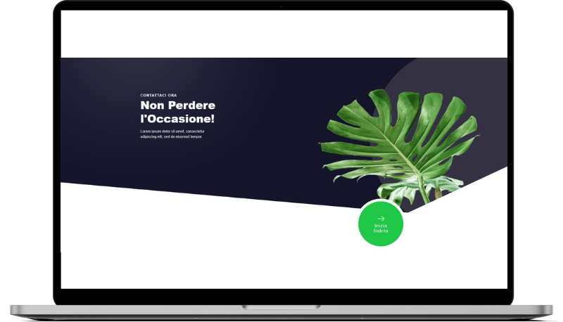
Arnad
HTML
<!-- ============================================ -->
<!--                    CTA                       -->
<!-- ============================================ -->

<section id="cta-461">
    <div class="cs-container">
        <div class="cs-content">
            <span class="cs-topper">Contattaci Ora</span>
            <h2 class="cs-title">Non Perdere l'Occasione!</h2>
            <p class="cs-text">
                Lorem ipsum dolor sit amet, consectetur adipiscing elit, sed do eiusmod tempor.
            </p>
        </div>
        <a href="" class="cs-cta">
            <svg class="cs-arrow" xmlns="http://www.w3.org/2000/svg" width="40" height="40" viewBox="0 0 40 40" fill="none"><path fill="#FAFBFC" d="M24.55 31.367c-.317 0-.633-.117-.883-.367a1.258 1.258 0 0 1 0-1.767L32.9 20l-9.233-9.233a1.258 1.258 0 0 1 0-1.767 1.258 1.258 0 0 1 1.766 0L35.55 19.117a1.258 1.258 0 0 1 0 1.766L25.433 31c-.25.25-.566.367-.883.367Z"/><path fill="#FAFBFC" d="M34.383 21.25H6.333A1.26 1.26 0 0 1 5.083 20c0-.683.567-1.25 1.25-1.25h28.05c.684 0 1.25.567 1.25 1.25a1.26 1.26 0 0 1-1.25 1.25Z"/></svg>
            <span class="cs-cta-text">Inizia <br>Subito</span>
        </a>
    </div>
    <img class="cs-decoration" aria-hidden="true" src="https://csimg.nyc3.cdn.digitaloceanspaces.com/FAQ/leaf.png" loading="lazy" decoding="async" alt="foglia" width="735" height="803">
</section>
CSS
/*-- -------------------------- -->
<---            CTA             -->
<--- -------------------------- -*/

/* Mobile - 360px */
@media only screen and (min-width: 0rem) {
  #cta-461 {
    padding: var(--sectionPadding);
    position: relative;
    overflow: hidden;
    z-index: 1;
  }
  #cta-461 .cs-container {
    width: 100%;
    max-width: 31.25rem;
    margin: auto;
  }
  #cta-461 .cs-swoosh {
    display: none;
  }
  #cta-461 .cs-container {
    width: 100%;
    max-width: 31.25rem;
    margin: auto;
    display: flex;
    flex-direction: column;
    align-items: center;
    gap: clamp(3rem, 6vw, 4rem);
  }
  #cta-461 .cs-content {
    text-align: left;
    width: 100%;
    max-width: 36.3125rem;
    display: flex;
    flex-direction: column;
    align-items: flex-start;
  }
  #cta-461 .cs-title,
  #cta-461 .cs-text {
    color: var(--bodyTextColorWhite);
  }
  #cta-461 .cs-text {
    opacity: .8;
  }
  #cta-461 .cs-decoration {
    display: none;
  }
  #cta-461 .cs-cta {
    font-size: clamp(0.875rem, 1.5vw, 1.25rem);
    text-decoration: none;
    text-align: center;
    width: clamp(8.8125rem, 17vw, 14rem);
    height: clamp(8.8125rem, 17vw, 14rem);
    margin: 0 2.25rem 1rem auto;
    background-color: var(--primaryLight);
    color: var(--bodyTextColorWhite);
    border-radius: 50%;
    display: flex;
    justify-content: center;
    align-items: center;
    flex-direction: column;
    align-self: flex-end;
    position: relative;
    transition: background-color 0.3s;
  }
  #cta-461 .cs-cta:hover {
    background-color: #14142b;
  }
  #cta-461 .cs-cta:hover .cs-arrow {
    transform: translateX(3.75rem);
    opacity: 0;
  }
  #cta-461 .cs-cta:hover .cs-cta-text {
    transform: translateY(-0.9375rem);
  }
  #cta-461 .cs-cta:before {
    content: "";
    width: 93.75rem;
    height: 62.5rem;
    background: #14142b;
    border-radius: 0 0 6.25rem 0;
    opacity: 1;
    position: absolute;
    display: block;
    bottom: -4.75rem;
    right: 2rem;
    transform: rotate(30deg);
    transform-origin: bottom right;
    z-index: -1;
  }
  #cta-461 .cs-arrow {
    width: 2.5rem;
    height: auto;
    transition: transform 0.3s,
                opacity 0.3s;
  }
  #cta-461 .cs-cta-text {
    transition: transform 0.3s;
  }
}
/* 500px */
@media only screen and (min-width: 31.25rem) {
  #cta-461 {
    overflow: hidden;
    padding-bottom: 12vw;
  }
  #cta-461 .cs-container {
    align-items: flex-start;
  }
  #cta-461 .cs-cta:before {
    border-radius: 9.375rem;
    bottom: -6.25rem;
    right: 1.25rem;
  }
}
/* Tablet - 768px */
@media only screen and (min-width: 48rem) {
  #cta-461 {
    margin-bottom: 3.75rem;
    padding-bottom: 0;
    background-color: #14142b;
    position: relative;
  }
  #cta-461:before {
    content: "";
    width: 37.75rem;
    height: 37.75rem;
    border-radius: 50%;
    background: #333142;
    opacity: 1;
    position: absolute;
    display: block;
    top: -6.25rem;
    right: -18.75rem;
    z-index: -2;
  }
  #cta-461 .cs-container {
    max-width: 80rem;
    position: relative;
  }
  #cta-461 .cs-container:before {
    content: "";
    width: 375rem;
    height: 62.5rem;
    margin-right: -93.75rem;
    background: #fff;
    pointer-events: none;
    opacity: 1;
    position: absolute;
    display: block;
    top: 50%;
    right: 50%;
    transform: rotate(5deg);
  }
  #cta-461 .cs-container:after {
    content: "";
    width: 375rem;
    height: 187.5rem;
    margin-right: -218.75rem;
    background: #fff;
    pointer-events: none;
    opacity: 1;
    position: absolute;
    display: block;
    top: 100%;
    right: 50%;
    transform: rotate(-25deg);
    z-index: -1;
  }
  #cta-461 .cs-text {
    width: 55%;
  }
  #cta-461 .cs-cta {
    box-sizing: border-box;
    border: 12px solid #fff;
    margin-right: clamp(6.25rem, 15vw, 6.25rem);
  }
  #cta-461 .cs-cta:before {
    display: none;
  }
}
/* Desktop 1200px */
@media only screen and (min-width: 75rem) {
  #cta-461 {
    padding-top: 10rem;
  }
  #cta-461:before {
    width: 51.5rem;
    height: 51.5rem;
    margin-left: 23.75rem;
    right: auto;
    left: 50%;
    top: -3.125rem;
    transform: none;
  }
  #cta-461:after {
    content: "";
    width: 39.3125rem;
    height: 28.6875rem;
    margin-right: 21.125rem;
    background: #f1f1f4;
    opacity: 0.16;
    -webkit-filter: blur(182px);
    filter: blur(182px);
    position: absolute;
    display: block;
    top: -16.4375rem;
    right: 50%;
  }
  #cta-461 .cs-text {
    margin-bottom: 12.5rem;
  }
  #cta-461 .cs-decoration {
    height: 50.1875rem;
    width: auto;
    margin-left: 8.75rem;
    display: block;
    position: absolute;
    bottom: 0;
    left: 50%;
    z-index: -2;
  }
}