AltoCode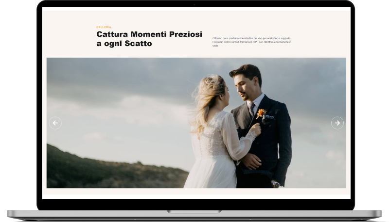
Laurito
HTML
<!-- ============================================ -->
<!--                   Gallery                    -->
<!-- ============================================ -->

<section id="gallery-2235">
    <div class="cs-container">
        <div class="cs-content">
            <div class="cs-flex-group">
                <span class="cs-topper">Galleria</span>
                <h2 class="cs-title">Cattura Momenti Preziosi a ogni Scatto</h2>
            </div>
            <p class="cs-text">
                Offriamo corsi on-demand e istruttori dal vivo per workshop e supporto.
                Forniamo inoltre corsi di formazione LIVE con istruttore e formazione in sede.
            </p>
        </div>
        <div class="cs-wrapper">
            <div class="cs-slideshow">
                <picture class="cs-slide initial">
                    <source media="(max-width: 600px)" srcset="https://csimg.nyc3.digitaloceanspaces.com/Images/People/wedding1.jpg">
                    <source media="(min-width: 601px)" srcset="https://csimg.nyc3.digitaloceanspaces.com/Images/People/wedding1.jpg">
                    <img loading="lazy" decoding="async" src="https://csimg.nyc3.digitaloceanspaces.com/Images/People/wedding1.jpg" alt="persone in un matrimonio" width="380" height="271">
                </picture>
                <picture class="cs-slide">
                    <source media="(max-width: 600px)" srcset="https://csimg.nyc3.cdn.digitaloceanspaces.com/Images/People/wedding7.jpg">
                    <source media="(min-width: 601px)" srcset="https://csimg.nyc3.cdn.digitaloceanspaces.com/Images/People/wedding7.jpg">
                    <img loading="lazy" decoding="async" src="https://csimg.nyc3.cdn.digitaloceanspaces.com/Images/People/wedding7.jpg" alt="persone in un matrimonio" width="380" height="271">
                </picture>
                <picture class="cs-slide">
                    <source media="(max-width: 600px)" srcset="https://csimg.nyc3.cdn.digitaloceanspaces.com/Images/People/wedding10.jpg">
                    <source media="(min-width: 601px)" srcset="https://csimg.nyc3.cdn.digitaloceanspaces.com/Images/People/wedding10.jpg">
                    <img loading="lazy" decoding="async" src="https://csimg.nyc3.cdn.digitaloceanspaces.com/Images/People/wedding10.jpg" alt="persone in un matrimonio" width="380" height="271">
                </picture>
                <div class="cs-slideshow-button cs-slideshow-next"></div>
                <div class="cs-slideshow-button cs-slideshow-prev"></div>
            </div>
        </div>
    </div>
</section>
CSS
/* ---------------------------------- */
/*           Gallery                  */
/* ---------------------------------- */

/* Mobile - 360px */
@media only screen and (min-width: 0rem) {
  #gallery-2235 {
    padding: var(--sectionPadding);
    background-color: #fbf5f1;
  }
  #gallery-2235 .cs-container {
    width: 100%;
    max-width: 120rem;
    margin: auto;
    display: flex;
    flex-direction: column;
    align-items: center;
    gap: clamp(3rem, 6vw, 4rem);
  }
  #gallery-2235 .cs-content {
    text-align: left;
    width: 100%;
    max-width: 80rem;
    display: flex;
    flex-direction: column;
    align-items: flex-start;
  }
  #gallery-2235 .cs-flex-group {
    display: flex;
    flex-direction: column;
    flex: none;
  }
  #gallery-2235 .cs-topper {
    color: var(--secondary);
  }
  #gallery-2235 .cs-text {
    max-width: none;
  }
  #gallery-2235 .cs-wrapper {
    width: 100%;
    overflow: hidden;
  }
  #gallery-2235 .cs-slideshow {
    position: relative;
    transform-style: preserve-3d;
  }
  #gallery-2235 .cs-slide {
    width: 100%;
    height: clamp(21.25rem, 60vw, 52.5rem);
    margin: auto;
    opacity: 0;
    display: block;
    position: absolute;
    top: 0;
    z-index: 100;
    transition: transform 0.3s, opacity 0.3s, z-index 0.3s;
  }
  #gallery-2235 .cs-slide img {
    width: 100%;
    height: 100%;
    object-fit: cover;
  }
  #gallery-2235 .cs-slide.initial,
  #gallery-2235 .cs-slide.active {
    opacity: 1;
    position: relative;
    z-index: 900;
  }
  #gallery-2235 .cs-slide.prev,
  #gallery-2235 .cs-slide.next {
    z-index: 800;
  }
  #gallery-2235 .cs-slide.prev {
    transform: translateX(-100%);
  }
  #gallery-2235 .cs-slide.next {
    transform: translateX(100%);
  }
  #gallery-2235 .cs-slideshow-button {
    width: clamp(2.25rem, 6vw, 5rem);
    height: clamp(2.25rem, 6vw, 5rem);
    cursor: pointer;
    border: 1px solid #fff;
    border-radius: 50%;
    position: absolute;
    top: 50%;
    z-index: 1000;
    transform: translateY(-50%);
  }
  #gallery-2235 .cs-slideshow-button::before {
    content: "";
    width: clamp(1.25rem, 5vw, 4rem);
    height: clamp(1.25rem, 5vw, 4rem);
    background-position: center;
    background-size: cover;
    background-repeat: no-repeat;
    position: absolute;
    top: 50%;
    left: 50%;
    transform: translate(-50%, -50%);
  }
  #gallery-2235 .cs-slideshow-button.cs-slideshow-prev {
    left: 1rem;
  }
  #gallery-2235 .cs-slideshow-button.cs-slideshow-prev::before {
    background-image: url("https://csimg.nyc3.cdn.digitaloceanspaces.com/Images/Icons/slideshow-left.svg");
  }
  #gallery-2235 .cs-slideshow-button.cs-slideshow-next {
    right: 1rem;
  }
  #gallery-2235 .cs-slideshow-button.cs-slideshow-next::before {
    background-image: url("https://csimg.nyc3.cdn.digitaloceanspaces.com/Images/Icons/slideshow-right.svg");
  }
}
/* Tablet - 768px */
@media only screen and (min-width: 48rem) {
  #gallery-2235 .cs-content {
    flex-direction: row;
    justify-content: space-between;
    align-items: flex-end;
    gap: 2.5rem;
  }
  #gallery-2235 .cs-title {
    margin-bottom: 0;
  }
  #gallery-2235 .cs-flex-group {
    width: 55%;
  }
}
JAVASCRIPT
class Slideshow {
  constructor() {
    this.slides = Array.from(document.querySelectorAll('.cs-slide'));
    this.nextButton = document.querySelector('.cs-slideshow-next');
    this.prevButton = document.querySelector('.cs-slideshow-prev');

    if (!this.slides.length) return;

    this.currentIndex = 0;
    this.isMoving = false;
    this.init();
  }

  init() {
    this.nextButton?.addEventListener('click', () => this.moveSlide('next'));
    this.prevButton?.addEventListener('click', () => this.moveSlide('prev'));
    this.updateSlideStates();
  }

  updateSlideStates() {
    this.slides.forEach((slide, index) => {
      slide.classList.remove('active', 'prev', 'next', 'initial');

      if (index === this.currentIndex) slide.classList.add('active');
      else if (index === this.getAdjacentIndex('prev')) slide.classList.add('prev');
      else if (index === this.getAdjacentIndex('next')) slide.classList.add('next');
    });
  }

  getAdjacentIndex(direction) {
    const total = this.slides.length;
    return direction === 'next'
      ? (this.currentIndex + 1) % total
      : (this.currentIndex - 1 + total) % total;
  }

  moveSlide(direction) {
    if (this.isMoving) return;
    this.isMoving = true;

    this.currentIndex = this.getAdjacentIndex(direction);
    this.updateSlideStates();

    setTimeout(() => (this.isMoving = false), 300);
  }
}
new Slideshow();