AltoCode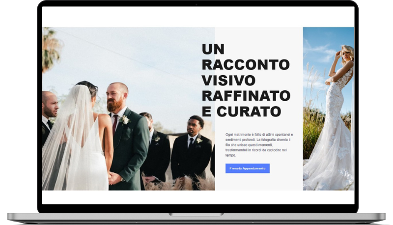
Atrani
HTML
<!-- ============================================ -->
<!--                     Hero                     -->
<!-- ============================================ -->

<section id="hero-2173">
    <div class="cs-container">
        <div class="cs-content">
            <picture class="cs-picture cs-picture1">
                <source media="(max-width: 600px)" srcset="https://csimg.nyc3.cdn.digitaloceanspaces.com/Images/People/wedding10.jpg">
                <source media="(min-width: 601px)" srcset="https://csimg.nyc3.cdn.digitaloceanspaces.com/Images/People/wedding10.jpg">
                <img loading="lazy" decoding="async" src="https://csimg.nyc3.cdn.digitaloceanspaces.com/Images/People/wedding10.jpg" alt="persone a un matrimonio" width="1058" height="936">
            </picture>
            <div class="cs-wrapper">
                <h2 class="cs-title">Un racconto visivo raffinato e curato</h2>
                <div class="cs-flex">
                    <p class="cs-text">
                        Ogni matrimonio è fatto di attimi spontanei e sentimenti profondi. La fotografia diventa il filo che unisce questi momenti, trasformandoli in ricordi da custodire nel tempo.
                    </p>
                    <a href="" class="cs-button-solid">Prenota Appuntamento</a>
                </div>
            </div>
            <picture class="cs-picture cs-picture2">
                <source media="(max-width: 1023px)" srcset="https://csimg.nyc3.cdn.digitaloceanspaces.com/Images/People/wedding11-m.jpg">
                <source media="(min-width: 1024px)" srcset="https://csimg.nyc3.cdn.digitaloceanspaces.com/Images/People/wedding11.jpg">
                <img loading="lazy" decoding="async" src="https://csimg.nyc3.cdn.digitaloceanspaces.com/Images/People/wedding11.jpg" alt="sposa" width="350" height="936">
            </picture>
        </div>
    </div>
</section>
CSS
/*-- -------------------------- -->
<---           Hero             -->
<--- -------------------------- -*/

/* Mobile - 360px */
@media only screen and (min-width: 0rem) {
  #hero-2173 {
    overflow: hidden;
    background-color: #f7f7f7;
    position: relative;
    z-index: 1;
  }
  #hero-2173 .cs-content {
    position: relative;
    z-index: 1;
  }
  #hero-2173 .cs-wrapper {
    padding: clamp(3.75rem, 5vw, 5rem) 1rem clamp(3.75rem, 9.6vw, 6.25rem);
  }
  #hero-2173 .cs-flex {
    padding-left: 3.75rem;
  }
  #hero-2173 .cs-title {
    font-size: clamp(2.4375rem, 6.5vw, 5.125rem);
    text-transform: uppercase;
    line-height: 1.1em;
    max-width: 18ch;
    margin-bottom: clamp(1rem, 6vw, 4.875rem);
  }
  #hero-2173 .cs-text {
    font-size: clamp(1rem, 2vw, 1.25rem);
    margin-bottom: 1rem;
  }
  #hero-2173 .cs-text:last-of-type {
    margin-bottom: 2rem;
  }
  #hero-2173 .cs-button-solid {
    font-size: 1rem;
    line-height: clamp(2.875rem, 5.5vw, 3.5rem);
    text-decoration: none;
    font-weight: 700;
    text-align: center;
    margin: 0;
    color: #fff;
    min-width: 9.375rem;
    padding: 0 1.5rem;
    background-color: var(--primary);
    display: inline-block;
    position: relative;
    z-index: 1;
    box-sizing: border-box;
  }
  #hero-2173 .cs-button-solid:before {
    content: "";
    position: absolute;
    height: 100%;
    width: 0%;
    background: #000;
    opacity: 1;
    top: 0;
    left: 0;
    z-index: -1;
    transition: width 0.3s;
  }
  #hero-2173 .cs-button-solid:hover:before {
    width: 100%;
  }
  #hero-2173 .cs-picture {
    width: 100%;
    height: auto;
    display: block;
    position: relative;
    z-index: 1;
  }
  #hero-2173 .cs-picture img {
    width: 100%;
    height: 100%;
    object-fit: cover;
    object-position: top;
    position: absolute;
    top: 0;
    left: 0;
  }
  #hero-2173 .cs-picture1 {
    width: 100%;
    height: 110vw;
  }
  #hero-2173 .cs-picture2 {
    width: 100%;
    height: 68vw;
    max-height: 21.3125rem;
    margin-left: 4.75rem;
  }
}
/* Tablet - 700px */
@media only screen and (min-width: 43.75rem) {
  #hero-2173 {
    margin-top: 7.5rem;
  }
  #hero-2173 .cs-container {
    display: flex;
    flex-direction: column;
    align-items: flex-end;
  }
  #hero-2173 .cs-content {
    width: 57vw;
  }
  #hero-2173 .cs-flex {
    padding-left: 8.75rem;
  }
  #hero-2173 .cs-picture1 {
    width: 56vw;
    height: 100vh;
    position: absolute;
    top: 0%;
    right: 82%;
    z-index: -1;
    transform: translateY(-10rem);
  }
  #hero-2173 .cs-picture2 {
    width: auto;
    margin-left: 13.5rem;
  }
}
/* Desktop - 1024px */
@media only screen and (min-width: 64rem) {
  #hero-2173 {
    padding-right: 18.75rem;
  }
  #hero-2173 .cs-content {
    width: 54%;
    max-width: 34rem;
    position: relative;
    z-index: 1;
  }
  #hero-2173 .cs-wrapper {
    padding-left: 0;
    padding-right: 0;
  }
  #hero-2173 .cs-title {
    max-width: 12ch;
  }
  #hero-2173 .cs-picture1 {
    width: 60vw;
    right: calc(100% - 5rem);
  }
  #hero-2173 .cs-picture2 {
    width: 30vw;
    max-width: 21.875rem;
    height: 100vh;
    max-height: 100vh;
    margin: 0;
    position: absolute;
    top: 50%;
    left: calc(100% + 2.5rem);
    transform: translateY(-50%);
  }
}
/* Large Desktop - 1920px */
@media only screen and (min-width: 120rem) {
  #hero-2173 {
    padding-right: 0;
    position: relative;
    z-index: 1;
  }
  #hero-2173 .cs-container {
    width: 100%;
    max-width: 80rem;
    margin: auto;
    padding-right: 5rem;
    box-sizing: border-box;
    position: initial;
  }
  #hero-2173 .cs-content {
    position: initial;
  }
  #hero-2173 .cs-picture1 {
    height: auto;
    margin-right: -5.875rem;
    right: 50%;
    top: 0;
    bottom: 0;
    transform: none;
  }
  #hero-2173 .cs-picture2 {
    height: auto;
    width: 20vw;
    max-height: none;
    max-width: none;
    margin-left: 37.875rem;
    left: 50%;
    top: 0;
    bottom: 0;
    transform: none;
  }
}