AltoCode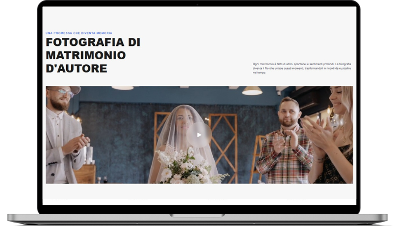
Miagliano
HTML
<!-- ============================================ -->
<!--                     Hero                     -->
<!-- ============================================ -->

<section id="hero-2153">
    <div class="cs-container">
        <div class="cs-content">
            <div class="cs-flex">
                <span class="cs-topper">Una promessa che diventa memoria</span>
                <h2 class="cs-title">Fotografia di matrimonio d'autore</h2>
            </div>
            <p class="cs-text">Ogni matrimonio è fatto di attimi spontanei e sentimenti profondi. La fotografia diventa il filo che unisce questi momenti, trasformandoli in ricordi da custodire nel tempo.</p>
        </div>
        <div class="cs-video-group">
            <div class="cs-video-wrapper">
                <video src="https://csimg.nyc3.cdn.digitaloceanspaces.com/Images/Videos/wedding.mp4"></video>
                <!-- <picture class="cs-picture">
                    <source media="(min-width: 601px)" srcset="https://csimg.nyc3.cdn.digitaloceanspaces.com/Images/People/wedding6.jpeg">
                    <source media="(max-width: 600px)" srcset="https://csimg.nyc3.cdn.digitaloceanspaces.com/Images/People/wedding6.jpeg">
                    <img decoding="async" src="https://csimg.nyc3.cdn.digitaloceanspaces.com/Images/People/wedding6.jpeg" alt="matrimonio" width="1720" height="547">
                </picture> -->
                <button class="cs-play" aria-label="cliccare per visualizzare il video">
                    <img class="cs-icon" src="https://csimg.nyc3.cdn.digitaloceanspaces.com/Images/Icons/play-right.svg" alt="icona play" width="20" height="22" aria-hidden="true" decoding="async">
                </button>
            </div>
        </div>
    </div>
</section>
CSS
/*-- -------------------------- -->
<---            Hero            -->
<--- -------------------------- -*/

/* Mobile - 360px */
@media only screen and (min-width: 0rem) {
  #hero-2153 {
    padding: var(--sectionPadding);
    padding: clamp(9.375rem, 16.95vw, 12.5rem) 1rem clamp(2.5rem, 4.82vw, 5.625rem) 1rem;
    background-color: #F7F7F7;
    overflow: hidden;
    position: relative;
    z-index: 1;
  }
  #hero-2153 .cs-container {
    width: 100%;
    max-width: 44rem;
    margin: auto;
    display: flex;
    flex-direction: column;
    align-items: center;
    gap: clamp(3rem, 5vw, 4rem);
    position: relative;
    z-index: 1;
  }
  #hero-2153 .cs-content {
    text-align: left;
    width: 100%;
    display: flex;
    flex-direction: column;
    align-items: center;
    position: relative;
    z-index: 1;
  }
  #hero-2153 .cs-flex {
    flex: none;
  }
  #hero-2153 .cs-title {
    font-size: clamp(2.438rem, 5vw, 3.813rem);
    text-transform: uppercase;
  }
  #hero-2153 .cs-text {
    max-width: none;
  }
  #hero-2153 .cs-video-group {
    width: 100%;
    height: clamp(21.25rem, 42.5vw, 34.2rem);
    display: block;
    position: relative;
    z-index: 1;
  }
  #hero-2153 .cs-video-wrapper {
    width: 100%;
    height: 100%;
    display: block;
    position: relative;
  }
  #hero-2153 .cs-video-wrapper:hover {
    cursor: pointer;
  }
  #hero-2153 .cs-video-wrapper:hover .cs-play {
    transform: translate(-50%, -50%) scale(1.2);
  }
  #hero-2153 .cs-video-wrapper video,
  #hero-2153 .cs-video-wrapper .cs-picture {
    width: 100%;
    height: 100%;
    object-fit: cover;
    position: absolute;
    top: 0;
    left: 0;
  }
  #hero-2153 .cs-video-wrapper video img,
  #hero-2153 .cs-video-wrapper .cs-picture img {
    width: 100%;
    height: 100%;
    object-fit: cover;
    position: absolute;
    top: 0;
    left: 0;
  }
  #hero-2153 .cs-video-wrapper video:before,
  #hero-2153 .cs-video-wrapper .cs-picture:before {
    content: '';
    width: 100%;
    height: 100%;
    background: linear-gradient(0deg, rgba(0, 0, 0, 0.2) 0%, rgba(0, 0, 0, 0.2) 100%);
    pointer-events: none;
    display: block;
    position: absolute;
    top: 0;
    left: 0;
    z-index: 1;
  }
  #hero-2153 .cs-play {
    width: clamp(5rem, 14vw, 7.5rem);
    height: clamp(5rem, 14vw, 7.5rem);
    background-color: rgba(255, 255, 255, 0.2);
    pointer-events: none;
    border: none;
    border-radius: 50%;
    display: flex;
    justify-content: center;
    align-items: center;
    position: absolute;
    top: 50%;
    left: 50%;
    z-index: 1;
    transform: translate(-50%, -50%);
    transition: transform 0.3s, opacity 0.3s;
    backdrop-filter: blur(8px);
  }
  #hero-2153 .cs-play.cs-hide {
    opacity: 0;
    transform: translate(-50%, -50%) scale(0) !important;
  }
  #hero-2153 .cs-icon {
    width: 1.25rem;
    height: auto;
  }
}
/* Tablet - 768px */
@media only screen and (min-width: 48rem) {
  #hero-2153 .cs-container {
    max-width: 59rem;
  }
  #hero-2153 .cs-content {
    flex-direction: row;
    justify-content: space-between;
    align-items: flex-end;
    gap: clamp(3rem, 6vw, 4rem);
  }
  #hero-2153 .cs-flex {
    width: 50%;
  }
  #hero-2153 .cs-title {
    margin: 0;
  }
  #hero-2153 .cs-text {
    max-width: 23.875rem;
  }
}
/* Desktop - 1024px */
@media only screen and (min-width: 64rem) {
  #hero-2153 .cs-container {
    max-width: 80rem;
  }
}
/* Large Desktop 1300px */
@media only screen and (min-width: 81.25rem) {
  #hero-2153 .cs-container {
    max-width: 107.5rem;
  }
  #hero-2153 .cs-text {
    max-width: 35rem;
  }
}
JAVASCRIPT
function togglePlayButton3() {
        const pictures = document.querySelectorAll('#hero-2153 .cs-video-wrapper');
        const buttons = document.querySelectorAll('#hero-2153 .cs-play');

        pictures.forEach(picture => {
            picture.addEventListener('click', () => {
                buttons.forEach(button => {
                    button.classList.toggle('cs-hide');
                });
            });
        });
    }

    togglePlayButton3();

    function toggleVideoPlayback3() {
        const video = document.querySelector('#hero-2153 video');

        video.addEventListener('click', () => {
            if (video.paused) {
                video.play();
            } else {
                video.pause();
            }
        });
    }

    toggleVideoPlayback3();