AltoCode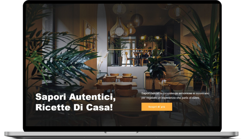
Quaranti
HTML
<!-- ============================================ -->
<!--                    Hero                      -->
<!-- ============================================ -->

<section id="hero-1950">
    <div class="cs-container">
        <div class="cs-content">
            <h1 class="cs-title">Sapori Autentici, Ricette Di Casa!</h1>
            <div class="cs-flex-group">
                <p class="cs-text">Sapori delicati e consistenze armoniose si incontrano per regalare un’esperienza che parla al cuore.</p>
                <a href="" class="cs-button-solid">Scopri di più</a>
            </div>
        </div>
    </div>
    <picture class="cs-background">
        <source media="(max-width: 600px)" srcset="https://csimg.nyc3.cdn.digitaloceanspaces.com/Images/MISC/restaurant-space.jpeg">
        <source media="(min-width: 601px)" srcset="https://csimg.nyc3.cdn.digitaloceanspaces.com/Images/MISC/restaurant-space.jpeg">
        <img decoding="async" src="https://csimg.nyc3.cdn.digitaloceanspaces.com/Images/MISC/restaurant-space.jpeg" alt="ristorante" width="2250" height="1500" aria-hidden="true">
    </picture>
</section>
CSS
/*-- -------------------------- -->
<---           Hero             -->
<--- -------------------------- -*/
/* Mobile - 360px */
@media only screen and (min-width: 0rem) {
  #hero-1950 {
    min-height: 100dvh;
    padding: clamp(12.5rem, 12vw, 18.75rem) 1rem clamp(3.75rem, 8vw, 6.25rem) 1rem;
    display: flex;
    align-items: flex-end;
    position: relative;
    z-index: 1;
  }
  #hero-1950 .cs-container {
    width: 100%;
    max-width: 85.5625rem;
    margin: 0 auto;
    display: flex;
    flex-direction: column;
    justify-content: flex-end;
    align-items: flex-end;
    gap: clamp(3.75rem, 13vw, 11.25rem);
  }
  #hero-1950 .cs-content {
    text-align: left;
    width: 100%;
    display: flex;
    flex-direction: column;
    align-items: flex-start;
  }
  #hero-1950 .cs-title {
    font-size: clamp(2.4375rem, 5vw, 3.8125rem);
    margin-bottom: 1.75rem;
    color: #fff;
  }
  #hero-1950 .cs-text {
    font-size: clamp(1rem, 2vw, 1.25rem);
    margin-bottom: 1.25rem;
    color: #fff;
    opacity: 0.8;
  }
  #hero-1950 .cs-flex-group {
    max-width: 30rem;
  }
  #hero-1950 .cs-button-solid {
    font-size: 1rem;
    font-weight: 700;
    line-height: clamp(2.875rem, 5.5vw, 3.5rem);
    text-decoration: none;
    margin: 0;
    padding: 0 clamp(2rem, 4vw, 3rem);
    background-color: var(--primary);
    color: #fff;
    display: inline-block;
    position: relative;
    z-index: 1;
  }
  #hero-1950 .cs-button-solid:before {
    content: '';
    width: 0%;
    height: 100%;
    background: #000;
    opacity: 1;
    display: block;
    position: absolute;
    top: 0;
    left: 0;
    z-index: -1;
    transition: width 0.3s;
  }
  #hero-1950 .cs-button-solid:hover:before {
    width: 100%;
  }
  #hero-1950 .cs-background {
    width: 100%;
    height: 100%;
    display: block;
    position: absolute;
    top: 0;
    left: 0;
    z-index: -2;
  }
  #hero-1950 .cs-background:before {
    content: '';
    width: 100%;
    height: 100%;
    background: linear-gradient(180deg, rgba(26, 26, 26, 0.86) 10.79%, rgba(26, 26, 26, 0) 48.32%, rgba(26, 26, 26, 0.86) 82.84%);
    pointer-events: none;
    display: block;
    position: absolute;
    top: 0;
    left: 0;
    z-index: 1;
  }
  #hero-1950 .cs-background img {
    width: 100%;
    height: 100%;
    object-fit: cover;
    position: absolute;
    top: 0;
    left: 0;
  }
}
/* Tablet - 768px */
@media only screen and (min-width: 48rem) {
  #hero-1950 .cs-content {
    text-align: left;
    flex-direction: row;
    justify-content: space-evenly;
    align-items: flex-start;
    gap: 2rem;
  }
  #hero-1950 .cs-title {
    width: 55%;
    max-width: 39.375rem;
    margin-bottom: 0;
    flex: none;
  }
  #hero-1950 .cs-flex-group {
    max-width: 30rem;
  }
}
/* Parallax Effect - 100px */
@media only screen and (min-width: 100rem) {
  #hero-1950 .cs-background {
    background: url("https://csimg.nyc3.cdn.digitaloceanspaces.com/Images/MISC/restaurant-space.jpeg");
    background-position: center;
    background-size: cover;
    background-repeat: no-repeat;
    background-attachment: fixed;
  }
  #hero-1950 .cs-background img {
    display: none;
  }
}