AltoCode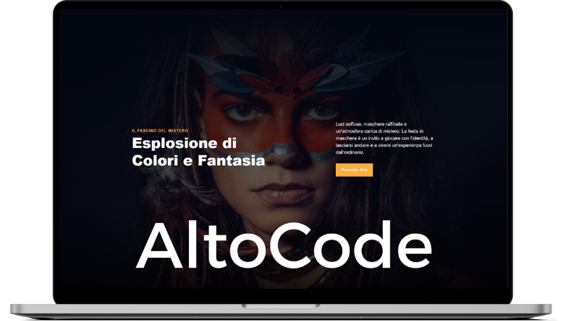
Torresina
HTML
<!-- ============================================ -->
<!--                   Hero                       -->
<!-- ============================================ -->

<section id="hero-2436">
    <div class="cs-container">
        <div class="cs-content">
            <div class="cs-flex cs-flex1">
                <span class="cs-topper">Il Fascino del Mistero</span>
                <h2 class="cs-title">Esplosione di Colori e Fantasia</h2>
            </div>
            <div class="cs-flex cs-flex2">
                <p class="cs-text">
                    Luci soffuse, maschere raffinate e un’atmosfera carica di mistero. La festa in maschera è un invito a giocare con l’identità, a lasciarsi andare e a vivere un’esperienza fuori dall’ordinario.
                </p>
                <a href="" class="cs-button-solid">Prenota Ora</a>
            </div>
        </div>
        <img class="cs-logo-feature" decoding="async" src="https://csimages.lon1.digitaloceanspaces.com/logo/altocode/004.svg" alt="logo" width="1280" height="239">
    </div>
    <picture class="cs-background">
        <source media="(max-width: 600px)" srcset="https://csimg.nyc3.cdn.digitaloceanspaces.com/Images/People/art4.jpg">
        <source media="(min-width: 601px)" srcset="https://csimg.nyc3.cdn.digitaloceanspaces.com/Images/People/art4.jpg">
        <img decoding="async" src="https://csimg.nyc3.cdn.digitaloceanspaces.com/Images/People/art4.jpg" alt="face with body art" width="1800" height="860" aria-hidden="true" fetchpriority="high">
    </picture>
</section>
CSS
/*-- -------------------------- -->
<---           Hero             -->
<--- -------------------------- -*/

/* Mobile */
@media only screen and (min-width: 0rem) {
  #hero-2436 {
    min-height: 100vh;
    padding: var(--sectionPadding);
    padding-top: clamp(13.75rem, 45vw, 29.6875rem);
    overflow: hidden;
    display: flex;
    align-items: flex-end;
    justify-content: center;
    position: relative;
    z-index: 1;
  }
  #hero-2436:before {
    content: '';
    width: 100%;
    height: 85%;
    background: linear-gradient(to bottom, #030711 0%, rgba(3, 7, 17, 0.35) 75%, rgba(3, 7, 17, 0) 100%);
    opacity: 1;
    display: block;
    position: absolute;
    top: 0;
    left: 0;
    z-index: -1;
  }
  #hero-2436:after {
    content: '';
    width: 100%;
    height: 35%;
    background: linear-gradient(to bottom, rgba(1, 1, 4, 0) 0%, #010104 100%);
    opacity: 1;
    display: block;
    position: absolute;
    bottom: 0;
    left: 0;
    z-index: -1;
  }
  #hero-2436 .cs-container {
    width: 100%;
    max-width: 80rem;
    margin: 0 auto;
    display: flex;
    flex-direction: column;
    align-items: center;
    gap: clamp(3rem, 8vw, 8rem);
  }
  #hero-2436 .cs-container:before {
    content: '';
    width: 100%;
    height: 100%;
    background: linear-gradient(to right, rgba(3, 7, 17, 0.64) 0%, rgba(3, 7, 17, 0.64) 18%, rgba(3, 7, 17, 0.51) 25%, rgba(3, 7, 17, 0.32) 35%, rgba(3, 7, 17, 0.32) 60%, rgba(3, 7, 17, 0.64) 78%, rgba(3, 7, 17, 0.64) 80%, rgba(3, 7, 17, 0.64) 100%);
    opacity: 1;
    display: block;
    position: absolute;
    bottom: 0;
    left: 0;
    z-index: -1;
  }
  #hero-2436 .cs-content {
    text-align: center;
    width: 100%;
    box-sizing: border-box;
    display: flex;
    flex-direction: column;
    align-items: center;
    row-gap: 1rem;
    column-gap: clamp(4rem, 10vw, 6.25rem);
  }
  #hero-2436 .cs-flex {
    text-align: inherit;
    display: flex;
    flex-direction: column;
    align-items: center;
  }
  #hero-2436 .cs-flex2 {
    max-width: 33.75rem;
  }
  #hero-2436 .cs-topper {
    color: var(--secondary);
  }
  #hero-2436 .cs-title {
    font-size: clamp(2.4375rem, 6vw, 3.8125rem);
    margin-bottom: 0;
    max-width: 15ch;
    color: var(--bodyTextColorWhite);
  }
  #hero-2436 .cs-text {
    font-size: clamp(1rem, 2vw, 1.25rem);
    color: var(--bodyTextColorWhite);
    margin-bottom: 2rem;
  }
  #hero-2436 .cs-button-solid {
    font-size: 1rem;
    font-weight: 700;
    line-height: clamp(2.875rem, 5.5vw, 3.5rem);
    text-align: center;
    text-decoration: none;
    min-width: 9.375rem;
    margin: 0;
    padding: 0 1.5rem;
    background-color: var(--primary);
    color: var(--bodyTextColorWhite);
    display: inline-block;
    position: relative;
    z-index: 1;
  }
  #hero-2436 .cs-button-solid:before {
    content: "";
    width: 0%;
    height: 100%;
    background: #000;
    opacity: 1;
    position: absolute;
    top: 0;
    left: 0;
    z-index: -1;
    transition: width 0.3s;
  }
  #hero-2436 .cs-button-solid:hover:before {
    width: 100%;
  }
  #hero-2436 .cs-logo-feature {
    width: 100%;
    height: auto;
    display: block;
  }
  #hero-2436 .cs-background {
    width: 100%;
    height: 100%;
    display: block;
    position: absolute;
    top: 0;
    left: 0;
    object-fit: cover;
    z-index: -2;
  }
  #hero-2436 .cs-background img {
    width: 100%;
    height: 100%;
    display: block;
    position: absolute;
    top: 0;
    left: 0;
    object-fit: cover;
  }
}
/* Desktop - 1024px */
@media only screen and (min-width: 64rem) {
  #hero-2436 .cs-content {
    flex-direction: row;
    justify-content: space-between;
  }
  #hero-2436 .cs-flex {
    text-align: left;
    align-items: flex-start;
  }
  #hero-2436 .cs-flex2 {
    max-width: 26.0625rem;
  }
}