AltoCode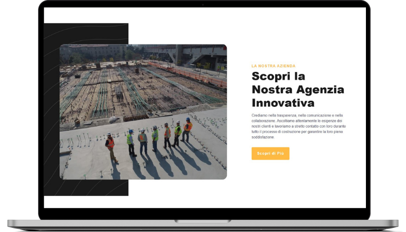
Gorreto
HTML
<!-- ============================================ -->
<!--                 Side By Side                 -->
<!-- ============================================ -->

<section id="sbs-1278">
    <div class="cs-container">
        <picture class="cs-picture">
            <source media="(max-width: 600px)" srcset="https://csimg.nyc3.cdn.digitaloceanspaces.com/Images/MISC/sbs-construction.jpg">
            <source media="(min-width: 601px)" srcset="https://csimg.nyc3.cdn.digitaloceanspaces.com/Images/MISC/sbs-construction.jpg">
            <img loading="lazy" decoding="async" src="https://csimg.nyc3.cdn.digitaloceanspaces.com/Images/MISC/sbs-construction.jpg" alt="costruzioni" width="738" height="598">
        </picture>
        <div class="cs-content">
            <div class="cs-flex">
                <span class="cs-topper">La Nostra Azienda</span>
                <h2 class="cs-title">Scopri la Nostra Agenzia Innovativa</h2>
            </div>
            <p class="cs-text">
                Crediamo nella trasparenza, nella comunicazione e nella collaborazione.
                Ascoltiamo attentamente le esigenze dei nostri clienti e lavoriamo a
                stretto contatto con loro durante tutto il processo di
                costruzione per garantire la loro piena soddisfazione.
            </p>
            <a href="" class="cs-button-solid">Scopri di Più</a>
        </div>
    </div>
    <picture class="cs-background">
        <source media="(max-width: 600px)" srcset="https://csimg.nyc3.cdn.digitaloceanspaces.com/Images/Graphics/white-waves-m.svg">
        <source media="(min-width: 601px)" srcset="https://csimg.nyc3.cdn.digitaloceanspaces.com/Images/Graphics/white-waves.svg">
        <img loading="lazy" decoding="async" src="https://csimg.nyc3.cdn.digitaloceanspaces.com/Images/Graphics/white-waves.svg" alt="" width="960" height="839">
    </picture>
</section>
CSS
/*-- -------------------------- -->
<---        Side By Side        -->
<--- -------------------------- -*/

/* Mobile - 360px */
@media only screen and (min-width: 0rem) {
    #sbs-1278 {
        padding: var(--sectionPadding);
        overflow: hidden;
        position: relative;
        z-index: 1;
    }
    #sbs-1278 .cs-container {
        width: 100%;
        max-width: 53.125rem;
        margin: auto;
        display: flex;
        justify-content: center;
        align-items: stretch;
        flex-direction: column;
        gap: clamp(3rem, 5vw, 6.75rem);
    }
    #sbs-1278 .cs-content {
        text-align: left;
        width: 100%;
        display: flex;
        flex-direction: column;
        align-items: flex-start;
    }

    #sbs-1278 .cs-title {
        max-width: 20ch;
    }
    #sbs-1278 .cs-text {
        margin-bottom: 1rem;
    }
    #sbs-1278 .cs-text:last-of-type {
        margin-bottom: 2rem;
    }
    #sbs-1278 .cs-button-solid {
        font-size: 1rem;
        line-height: clamp(2.875em, 5.5vw, 3.5em);
        text-decoration: none;
        font-weight: 700;
        text-align: center;
        margin: 0;
        color: #fff;
        border: none;
        min-width: 9.375rem;
        padding: 0 1.5rem;
        background-color: var(--primary);
        border-radius: 0.25rem;
        overflow: hidden;
        display: inline-block;
        position: relative;
        z-index: 1;
        box-sizing: border-box;
        transition: color 0.3s;
    }
    #sbs-1278 .cs-button-solid:before {
        content: "";
        position: absolute;
        height: 100%;
        width: 0%;
        background: #000;
        opacity: 1;
        top: 0;
        left: 0;
        z-index: -1;
        transition: width 0.3s;
    }
    #sbs-1278 .cs-button-solid:hover {
        color: #fff;
    }
    #sbs-1278 .cs-button-solid:hover:before {
        width: 100%;
    }
    #sbs-1278 .cs-picture {
        width: 100%;
        height: clamp(28.5rem, 46vw, 37.375rem);
        border-radius: 1.25rem;
        overflow: hidden;
        display: block;
        order: 2;
        position: relative;
        z-index: 1;
    }
    #sbs-1278 .cs-picture:before {
        content: "";
        width: 100%;
        height: 100%;
        background: #1a1a1a;
        opacity: 0.3;
        position: absolute;
        display: block;
        top: 0;
        left: 0;
        z-index: 1;
    }
    #sbs-1278 .cs-picture img {
        width: 100%;
        height: 100%;
        object-fit: cover;
        position: absolute;
        top: 0;
        left: 0;
    }
    #sbs-1278 .cs-background {
        width: 100%;
        height: 50%;
        background-color: #1a1a1a;
        display: block;
        position: absolute;
        bottom: 0;
        left: 0;
        z-index: -1;
    }
    #sbs-1278 .cs-background img {
        width: 100%;
        height: 100%;
        object-fit: cover;
        position: absolute;
        top: 0;
        left: 0;
    }
}
/* Tablet - 768px */
@media only screen and (min-width: 48rem) {
    #sbs-1278 .cs-content {
        flex-direction: row;
        flex-wrap: wrap;
        justify-content: space-between;
        row-gap: 2rem;
    }
    #sbs-1278 .cs-flex {
        width: 45%;
    }
    #sbs-1278 .cs-title {
        margin: 0;
    }
    #sbs-1278 .cs-text {
        width: 50%;
    }
    #sbs-1278 .cs-button-solid {
        margin-right: auto;
    }
}
/* Desktop - 1024px */
@media only screen and (min-width: 64rem) {
    #sbs-1278 {
        padding: var(--sectionPadding);
    }
    #sbs-1278 .cs-container {
        max-width: 80rem;
        flex-direction: row;
        align-items: center;
        justify-content: space-between;
    }
    #sbs-1278 .cs-content {
        width: 100%;
        max-width: 27.0625rem;
        margin: 0;
        flex-direction: column;
        order: 2;
        row-gap: 0;
    }
    #sbs-1278 .cs-flex {
        width: 100%;
    }
    #sbs-1278 .cs-title {
        margin: 0 0 1rem 0;
        color: var(--headerColor);
    }
    #sbs-1278 .cs-text {
        width: 100%;
    }
    #sbs-1278 .cs-picture {
        max-width: 46.125rem;
        order: 1;
    }
    #sbs-1278 .cs-background {
        width: 60vw;
        height: 100%;
        margin-right: clamp(11.125rem, 30vw, 21rem);
        left: auto;
        right: 50%;
        top: 0;
    }
}