AltoCode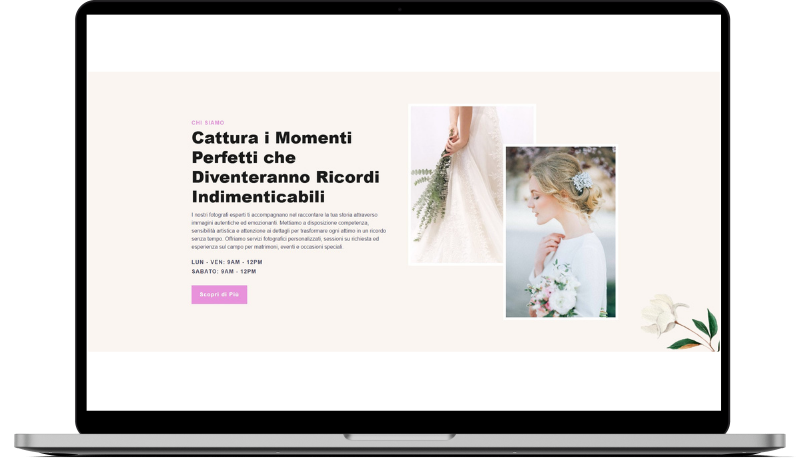
Olivola Reversed
HTML
<!-- ============================================ -->
<!--            Side By Side Reversed             -->
<!-- ============================================ -->

<section id="sbsr-2202">
    <div class="cs-container">
        <div class="cs-content">
            <span class="cs-topper">Chi Siamo</span>
            <h2 class="cs-title">Cattura i Momenti Perfetti che Diventeranno Ricordi Indimenticabili</h2>
            <p class="cs-text">
                I nostri fotografi esperti ti accompagnano nel raccontare la tua storia attraverso
                immagini autentiche ed emozionanti. Mettiamo a disposizione competenza, sensibilità
                artistica e attenzione ai dettagli per trasformare ogni attimo in un ricordo senza tempo.
                Offriamo servizi fotografici personalizzati, sessioni su richiesta ed
                esperienza sul campo per matrimoni, eventi e occasioni speciali.
            </p>
            <span class="cs-weekdays">Lun - Ven: 9am - 12pm</span>
            <span class="cs-weekends">Sabato: 9am - 12pm</span>
            <a href="" class="cs-button-solid">Scopri di Più</a>
        </div>
        <div class="cs-image-group">
            <picture class="cs-picture cs-picture1">
                <source media="(max-width: 600px)" srcset="https://csimg.nyc3.cdn.digitaloceanspaces.com/Images/People/wedding4.jpeg">
                <source media="(min-width: 601px)" srcset="https://csimg.nyc3.cdn.digitaloceanspaces.com/Images/People/wedding4.jpeg">
                <img loading="lazy" decoding="async" src="https://csimg.nyc3.cdn.digitaloceanspaces.com/Images/People/wedding4.jpeg" alt="mano" width="272" height="337">
            </picture>
            <picture class="cs-picture cs-picture2">
                <source media="(max-width: 600px)" srcset="https://csimg.nyc3.cdn.digitaloceanspaces.com/Images/People/wedding18.jpg">
                <source media="(min-width: 601px)" srcset="https://csimg.nyc3.cdn.digitaloceanspaces.com/Images/People/wedding18.jpg">
                <img loading="lazy" decoding="async" src="https://csimg.nyc3.cdn.digitaloceanspaces.com/Images/People/wedding18.jpg" alt="donna" width="243" height="367">
            </picture>
        </div>
    </div>
    <img class="cs-flower" loading="lazy" decoding="async" src="https://csimg.nyc3.cdn.digitaloceanspaces.com/Images/Graphics/flower-tilted.png" alt="" width="244" height="186">
</section>
CSS
/*-- -------------------------- -->
<---   Side By Side Reversed    -->
<--- -------------------------- -*/

/* Mobile - 360px */
@media only screen and (min-width: 0rem) {
  #sbsr-2202 {
    padding: var(--sectionPadding);
    background-color: #FBF5F1;
    overflow: hidden;
    position: relative;
    z-index: 1;
  }
  #sbsr-2202 .cs-container {
    width: 100%;
    max-width: 44rem;
    margin: auto;
    display: flex;
    flex-direction: column;
    align-items: center;
    gap: clamp(3rem, 6vw, 4rem);
  }
  #sbsr-2202 .cs-content {
    text-align: center;
    width: 100%;
    max-width: 36.625rem;
    display: flex;
    flex-direction: column;
    align-items: center;
  }
  #sbsr-2202 .cs-title {
    max-width: 30ch;
  }
  #sbsr-2202 .cs-text {
    margin-bottom: 1.5rem;
  }
  #sbsr-2202 .cs-weekdays,
  #sbsr-2202 .cs-weekends {
    font-size: 1rem;
    font-weight: 700;
    line-height: 1.2em;
    text-transform: uppercase;
    letter-spacing: 1.6px;
    color: var(--bodyTextColor);
  }
  #sbsr-2202 .cs-weekdays {
    margin-bottom: 0.5rem;
  }
  #sbsr-2202 .cs-button-solid {
    font-size: 1rem;
    font-weight: 700;
    line-height: clamp(2.875rem, 5.5vw, 3.5rem);
    text-align: center;
    text-decoration: none;
    min-width: 9.375rem;
    margin: 2rem 0 0 0;
    box-sizing: border-box;
    padding: 0 1.5rem;
    background-color: var(--primary);
    color: #fff;
    display: inline-block;
    position: relative;
    z-index: 1;
  }
  #sbsr-2202 .cs-button-solid:before {
    content: "";
    width: 0%;
    height: 100%;
    background: #000;
    opacity: 1;
    border-radius: 0.25rem;
    position: absolute;
    top: 0;
    left: 0;
    z-index: -1;
    transition: width 0.3s;
  }
  #sbsr-2202 .cs-button-solid:hover:before {
    width: 100%;
  }
  #sbsr-2202 .cs-image-group {
    font-size: min(2.3vw, .75rem);
    width: 39.375em;
    height: 39.1875em;
    order: -1;
    position: relative;
    flex: none;
  }
  #sbsr-2202 .cs-picture {
    overflow: hidden;
    border: 8px solid #fff;
    display: block;
    position: absolute;
  }
  #sbsr-2202 .cs-picture img {
    width: 100%;
    height: 100%;
    object-fit: cover;
    position: absolute;
    top: 0;
    left: 0;
  }
  #sbsr-2202 .cs-picture1 {
    width: 24em;
    height: 29.375em;
    top: 0;
    left: 0;
  }
  #sbsr-2202 .cs-picture2 {
    width: 21.5625em;
    height: 31.875em;
    right: 0;
    bottom: 0;
  }
  #sbsr-2202 .cs-flower {
    width: clamp(8.5625rem, 20vw, 19.3125rem);
    height: auto;
    display: block;
    position: absolute;
    right: -2rem;
    bottom: -0.5rem;
  }
}
/* Tablet - 768px */
@media only screen and (min-width: 48rem) {
  #sbsr-2202 .cs-container {
    max-width: 80rem;
  }
  #sbsr-2202 .cs-flower {
    right: 0;
    bottom: 0;
  }
}
/* Desktop - 1024px */
@media only screen and (min-width: 64rem) {
  #sbsr-2202 .cs-container {
    flex-direction: row;
    justify-content: center;
    align-items: stretch;
  }
  #sbsr-2202 .cs-content {
    text-align: left;
    padding: 3rem 0;
    align-self: center;
    align-items: flex-start;
  }
  #sbsr-2202 .cs-image-group {
    font-size: min(1.3vw, 1rem);
    height: auto;
    min-height: 39.1875em;
    order: 2;
  }
  #sbsr-2202 .cs-picture1 {
    height: 74.960128%;
  }
  #sbsr-2202 .cs-picture2 {
    height: 81.339719%;
  }
}