AltoCode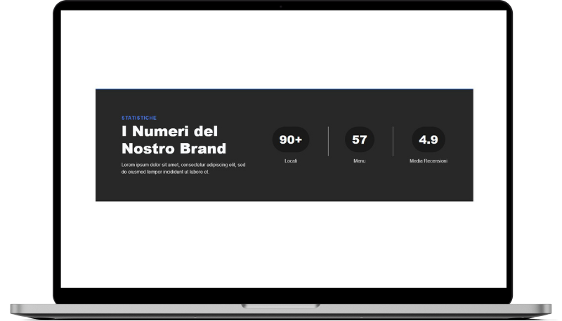
Ascea 3 Statistiche
HTML
<!-- ============================================ -->
<!--                 Statistiche                  -->
<!-- ============================================ -->

<section id="stats-1023">
    <div class="cs-container">
        <div class="cs-content">
            <span class="cs-topper">Statistiche</span>
            <h2 class="cs-title">I Numeri del Nostro Brand</h2>
            <p class="cs-text">
                Lorem ipsum dolor sit amet, consectetur adipiscing elit, sed do eiusmod tempor incididunt ut labore et.
            </p>
        </div>
        <ul class="cs-card-group">
            <li class="cs-item">
                <span class="cs-number">90+</span>
                <span class="cs-desc">Locali</span>
            </li>
            <li class="cs-item">
                <span class="cs-number">57</span>
                <span class="cs-desc">Menu</span>
            </li>
            <li class="cs-item">
                <span class="cs-number">4.9</span>
                <span class="cs-desc">Media Recensioni</span>
            </li>
        </ul>
    </div>
</section>
CSS
/*-- -------------------------- -->
<---         Statistiche        -->
<--- -------------------------- -*/

/* Mobile - 360px */
@media only screen and (min-width: 0rem) {
    #stats-1023 {
        padding: var(--sectionPadding);
    }
    #stats-1023 .cs-container {
        width: 100%;
        max-width: 80rem;
        padding: clamp(2.5rem, 7vw, 5.5rem);
        box-sizing: border-box;
        margin: auto;
        background-color: #282828;
        border-top: 2px solid var(--primary);
        display: flex;
        flex-direction: column;
        align-items: center;
        gap: clamp(3rem, 6vw, 4rem);
    }
    #stats-1023 .cs-content {
        text-align: center;
        width: 100%;
        max-width: 27.125rem;
        display: flex;
        flex-direction: column;
        align-items: center;
    }

    #stats-1023 .cs-title,
    #stats-1023 .cs-text {
        color: var(--bodyTextColorWhite);
    }
    #stats-1023 .cs-text {
        opacity: 0.8;
    }
    #stats-1023 .cs-card-group {
        width: 100%;
        margin: 0;
        padding: 0;
        display: flex;
        flex-direction: column;
        align-items: center;
        justify-content: center;
    }
    #stats-1023 .cs-item {
        list-style: none;
        margin: 0;
        padding: 0;
        display: flex;
        flex-direction: column;
        align-items: center;
        justify-content: center;
        position: relative;
    }
    #stats-1023 .cs-item:last-of-type:after {
        display: none;
    }
    #stats-1023 .cs-item:after {
        content: "";
        margin: clamp(1.25rem, 6vw, 5rem) 0;
        width: 100%;
        height: 1px;
        background: #e8e8e8;
        display: block;
    }
    #stats-1023 .cs-number {
        font-size: clamp(1.9375rem, 4vw, 2.4375rem);
        font-weight: 900;
        text-align: center;
        line-height: 1.2em;
        margin: 0 0 clamp(0.75rem, 2vw, 1.25rem) 0;
        padding: 1.25rem 1.5rem;
        box-sizing: border-box;
        color: var(--bodyTextColorWhite);
        background-color: #1a1a1a;
        border-radius: 5rem;
        display: block;
    }
    #stats-1023 .cs-desc {
        font-size: 1rem;
        line-height: 1.2em;
        color: var(--bodyTextColorWhite);
        opacity: 0.8;
    }
}
/* Tablet - 768px */
@media only screen and (min-width: 48rem) {
    #stats-1023 .cs-card-group {
        width: auto;
        flex-direction: row;
        align-items: center;
        flex-wrap: nowrap;
        flex: none;
        gap: clamp(5.5rem, 9.8vw, 7.5rem);
    }
    #stats-1023 .cs-item:after {
        width: 1px;
        height: 6.25rem;
        margin: 0;
        position: absolute;
        top: 0;
        right: calc(clamp(2.75rem, 4.7vw, 4rem) * -1);
    }
}
/* Desktop - 1024px */
@media only screen and (min-width: 64rem) {
    #stats-1023 .cs-container {
        flex-direction: row;
        justify-content: space-between;
    }
    #stats-1023 .cs-content {
        text-align: left;
        align-items: flex-start;
    }
}